
How to add captions to a vertical video that people can actually read
Transcribing is solved. Size, position and style are the decisions. Five caption styles, a rule for size on a phone, and the one place captions never cover a face.
Most vertical video is watched with the sound off, so the captions are the words. Generating them is a solved problem; every editor can put a transcript on the screen. What separates captions people read from captions people scroll past is size, position and style, and those are decisions, not transcription.
This is how captions are made in Narrative, which of the five styles suits which video, how big they should be on a phone, and where to put them so they never sit on a face. The creator clip below has its captions on its timeline, open to anyone; the podcast clip shows a second placement in its finished render.
Where the words come from
Captions are built from the transcript, timed to the word. Every upload is transcribed and then re-timed by a forced aligner, so a word’s start and end are the word’s, not a rough line timing. Only the words that survived the cut are captioned: trim a clip and its captions trim with it, because they are drawn from the edit, not pasted over it.
Sung words are a special case. A transcript of a full mix mishears singing, so an edit whose words are lyrics needs the vocals separated first. Ask for lyric captions and the track’s vocals are isolated and transcribed as sung, timings included, before the captions are drawn.
Five styles, and what each is for
- Simple. One group of words at a time, white in a black outline, centred in the frame. The default when the brief just says “captions”. It reads on any footage and never asks for attention.
- Word-highlight. Groups of up to four words, large, near the bottom, the current word in an accent colour and slightly scaled. The fast-social look. Ask for a pill behind the current word if you want more.
- Podcast. A fixed house style: Montserrat Black, uppercase, centred in the frame, each word popping on its own beat. The default for any podcast or interview cut, and the look the creator clip wears.
- Karaoke. Longer lines, six to eight words, filled left to right as they are sung. For music and rhythm, and for lyric videos.
- Boxed. A whole sentence in a dark glass box, no per-word motion, a longer hold. Reads like broadcast subtitles. For interviews and for footage that is already busy.
One item, not a hundred
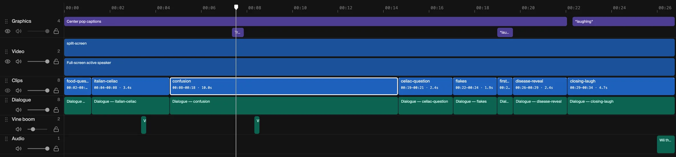
On the timeline the captions are a single block that spans the whole cut, not a text box per line. Every word’s timing lives in the transcript; the block is the style and the placement. That is why a request like “captions bigger” or “boxed instead” is one change, and why trimming a clip never leaves a stray caption behind.
How big
Caption sizes that look right on a laptop are too small on a phone, and most vertical video is designed on a laptop. The sizes in Narrative’s presets are written for a 16:9 frame and scaled up for 9:16: on a 1920-pixel-tall frame the simple style is 96 px and word-highlight is 118 px, which is five to six percent of the frame’s height. That is a good rule for any tool: a caption on a phone should be about a twentieth of the screen tall. Ask for “bigger” and it scales; ask for a size and it uses it.
Where
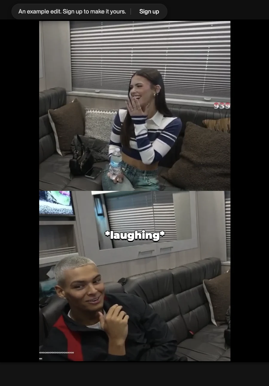
Two rules. First, clear of the platform. The bottom of a Reel or a Short is covered by the caption, the buttons and the progress bar, so a caption “at the bottom” should sit well above the bottom edge; the word-highlight preset does. Second, never on a face. In the creator clip, two people are stacked one above the other, and the captions sit in the gap between them, where they cover nobody. When there is one speaker, centred captions on the chest are safer than captions across the chin.
Which font
The default is TikTok Sans, the same face the Text tab starts on, with the black outline TikTok draws around text on footage. Name a font and it is used, fetched from Google Fonts if it is there. The outline is what keeps white text legible over a bright sky; if you want plain text, say “no outline”. The podcast preset does not restyle; it is a fixed look, which is the point of a house style.
How to ask
The style name is enough for the style. The rest is position, size and grouping:
- “Podcast captions.” The whole preset, as is.
- “Word-highlight captions, accent yellow, four words at a time.”
- “Boxed captions under the speaker, a sentence at a time.”
- “Simple captions in the middle, never over a face, a bit bigger than default.”
- “Lyric captions, karaoke fill” for a music video.
Cut this to a 45-second vertical clip. Word-highlight captions, three or four words at a time, white with the current word in orange, sitting a third of the way up so they clear the Reels UI.
After the first cut, corrections are the same sentence shorter: “captions bigger”, “move them up”, “boxed instead”. Each is a version you can step back from.
See it on a timeline
Open the creator clip and press play; watch each word take its turn in the gap between the two speakers, then look at the single captions block on the graphics row. Opening it needs no account, and the first change you ask for starts a free trial.